tencent cloud

Chat

React

Download
Mode fokus
Ukuran font
Terakhir diperbarui: 2026-08-31 14:22:53
TUIKit is a UI component library based on the Chat SDK. It enables quick implementation of chat, session, search, relationship chain, group, and other features through UI components. This article introduces how to quickly integrate TUIKit and implement core features.
Or, if you prefer a faster and more automated approach, you can refer to Build with AI to streamline the process.

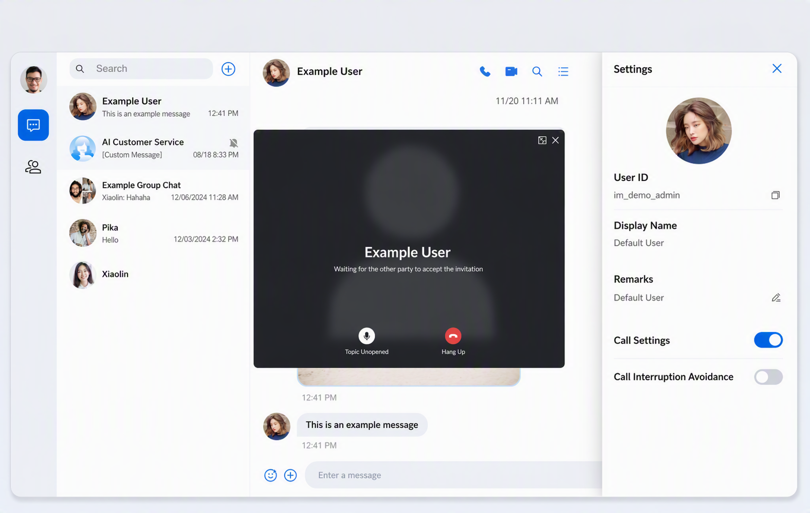
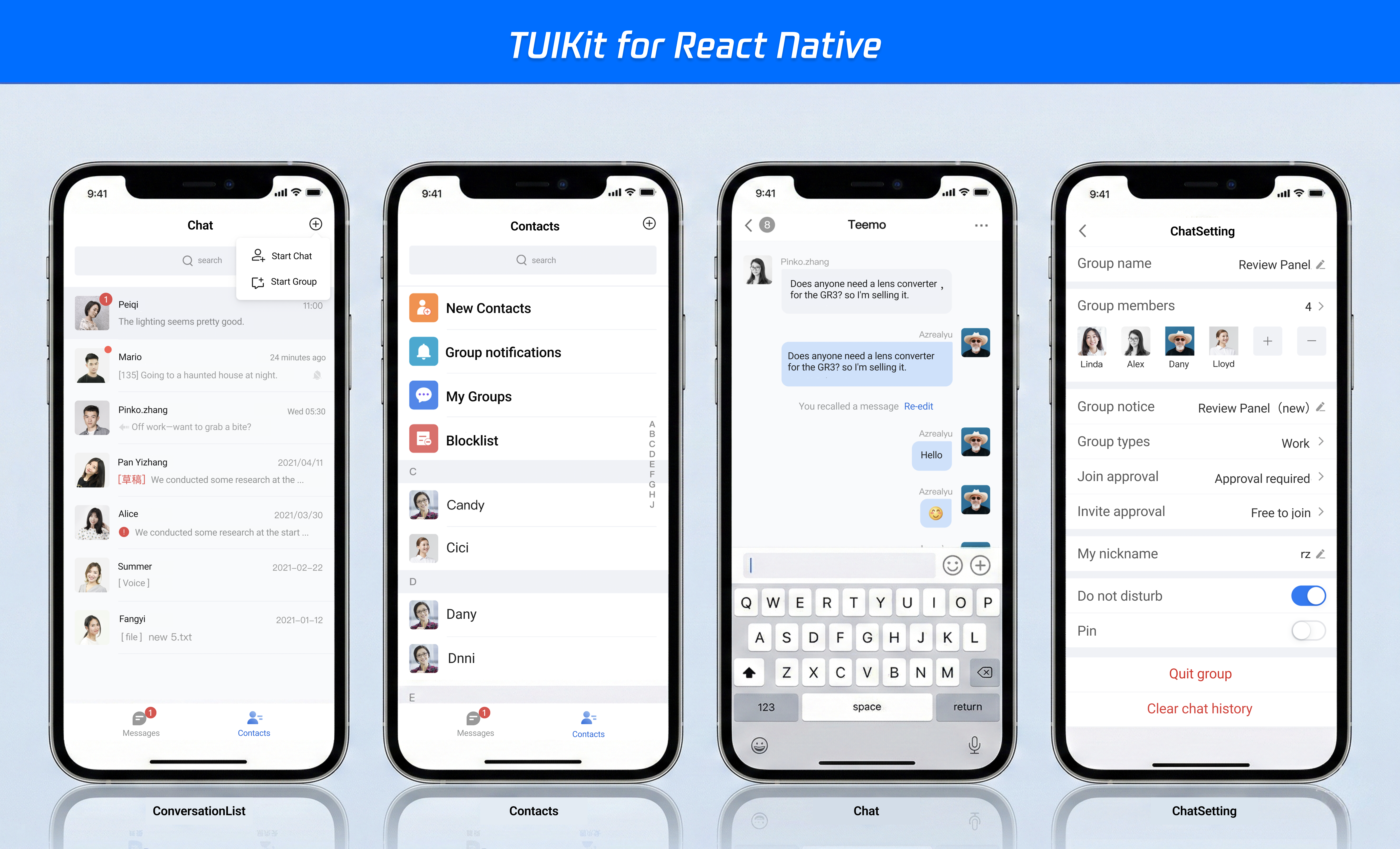
TUIKit also supports React Native; by integrating the React Native UIKit, you can build applications for both Android and iOS. The result is shown below:


Prerequisites

Node.js v18 or higher (LTS v22 version is recommended)
React^18.2.0 || React^19.0.0

Create a project

Create a new React project named chat-integration-react , and complete project initialization as prompted by the scaffold.
npm create vite@latest
You can refer to the following options:
◇ Project name:
│ chat-integration-react
◇ Select a framework:
│ React
◇ Select a variant:
│ TypeScript + React Compiler
◆ Install with npm and start now?
│ ● Yes / ○ No

Installing and Importing Components

Step 1: Dependency Installation

Download chat-uikit-react via npm and use it in the project.
Tips:
It is recommended to use npm for installation, as npm will automatically download the required peerDependencies dependencies.
npm i @tencentcloud/chat-uikit-react

Step 2: Introducing the chat UIKit react component

Note:
The following code does not include SDKAppID, userID, and UserSig. You need to replace them with the relevant information obtained in console.
Copy the following App.tsx code and replace the original content in App.tsx.
App.tsx
import { useEffect, useState, useMemo } from "react";
import {
UIKitProvider,
useLoginState,
LoginStatus,
ConversationList,
Chat,
ChatHeader,
MessageList,
MessageInput,
ContactList,
ContactInfo,
ChatSetting,
Search,
VariantType,
Avatar,
useUIKit,
useChatContext,
} from "@tencentcloud/chat-uikit-react";
import { IconChat, IconUsergroup, IconBulletpoint, IconSearch } from "@tencentcloud/uikit-base-component-react";

function App() {
// Lauguage support en-US(default) / zh-CN / ja-JP / ko-KR / zh-TW
// Theme support light(default) / dark
return (
<UIKitProvider theme={'light'} language={'en-US'}>
<ChatApp />
</UIKitProvider>
);
}

function ChatApp() {
const { language } = useUIKit();

const texts = useMemo(() =>
language === 'en-US'
? { emptyTitle: 'No conversation', emptySub: 'Select a conversation to start chatting', error: 'Please check the SDKAppID, userID, and userSig. View the specific error information through the developer tools (F12).', loading: 'Logging in...' },
: { emptyTitle: 'No conversation', emptySub: 'Select a conversation to start chatting', error: 'Please check the SDKAppID, userID, and userSig. View the specific error information through the developer tools (F12).', loading: 'Logging in...' },
[language]
);

const { status } = useLoginState({
SDKAppID: 0, // number
userID: '', // string
userSig: '', // string
});

if (status === LoginStatus.ERROR) {
return (
<div className="loading-container is-error">
<div className="loading-brand">
<div className="loading-brand-icon">
<svg viewBox="0 0 24 24"><path d="M20 2H4c-1.1 0-2 .9-2 2v18l4-4h14c1.1 0 2-.9 2-2V4c0-1.1-.9-2-2-2zm0 14H6l-2 2V4h16v12z"/></svg>
</div>
<span className="loading-brand-name">Chat</span>
</div>
<div className="error-icon">!</div>
<div className="loading-text">{texts.error}</div>
</div>
);
}

if (status !== LoginStatus.SUCCESS) {
return (
<div className="loading-container">
<div className="loading-brand">
<div className="loading-brand-icon">
<svg viewBox="0 0 24 24"><path d="M20 2H4c-1.1 0-2 .9-2 2v18l4-4h14c1.1 0 2-.9 2-2V4c0-1.1-.9-2-2-2zm0 14H6l-2 2V4h16v12z"/></svg>
</div>
<span className="loading-brand-name">Chat</span>
</div>
<div className="loading-spinner"></div>
<div className="loading-text">{texts.loading}</div>
<div className="loading-progress-bar">
<div className="loading-progress-bar-inner"></div>
</div>
</div>
);
}

return <ChatLayout texts={texts} />;
}

function ChatLayout({ texts }: { texts: { emptyTitle: string; emptySub: string } }) {
const [activeTab, setActiveTab] = useState<'conversations' | 'contacts'>('conversations');
const [isChatSettingShow, setIsChatSettingShow] = useState(false);
const [isSearchInChatShow, setIsSearchInChatShow] = useState(false);

const { theme } = useUIKit();
const isDark = theme === 'dark';

const { activeConversation } = useChatContext();

useEffect(() => {
setIsChatSettingShow(false);
setIsSearchInChatShow(false);
}, [activeConversation?.conversationID]);

return (
<div className={`chat-layout ${isDark ? 'dark' : ''}`}>
<SideTab activeTab={activeTab} onTabChange={setActiveTab} />

{/* middle -> conversation list or contact list */}
<div className="conversation-list-panel">
{activeTab === 'conversations' ? <ConversationList /> : <ContactList className="contact-list" />}
</div>

{/* right -> chat */}
{activeTab === 'conversations' && (
<Chat
className="chat-content-panel"
PlaceholderEmpty={
<div className="empty-placeholder">
<div className="empty-icon">💬</div>
<div className="empty-title">{texts.emptyTitle}</div>
<div className="empty-subtitle">{texts.emptySub}</div>
</div>
}
>
<div className="chat-main">
<ChatHeader
enableCall
ChatHeaderRight={
<div className="header-actions">
<button
className="icon-button"
onClick={() => setIsSearchInChatShow(!isSearchInChatShow)}
>
<IconSearch size="20px" />
</button>
<button
className="icon-button"
onClick={() => setIsChatSettingShow(!isChatSettingShow)}
>
<IconBulletpoint size="20px" />
</button>
</div>
}
/>
<MessageList />
<MessageInput />
</div>

{/* search in specific chat */}
{isSearchInChatShow && (
<div className="chat-sidebar-search">
<div className="chat-sidebar-header">
<span className="chat-sidebar-title">Chat Search</span>
<button
className="icon-button"
onClick={() => setIsSearchInChatShow(false)}
>
</button>
</div>
<Search variant={VariantType.EMBEDDED} />
</div>
)}
{/* chat setting */}
{isChatSettingShow && (
<div className="chat-float-sidebar">
<ChatSetting onClose={() => setIsChatSettingShow(false)} />
</div>
)}
</Chat>
)}

{/* contact detail info */}
{activeTab === 'contacts' && (
<ContactInfo
className="contact-detail-panel"
onSendMessage={() => setActiveTab('conversations')}
onEnterGroup={() => setActiveTab('conversations')}
/>
)}
</div>
);
}

// SideTab
interface SideTabProps {
activeTab: 'conversations' | 'contacts';
onTabChange: (tab: 'conversations' | 'contacts') => void;
}

function SideTab({ activeTab, onTabChange }: SideTabProps) {
const { theme } = useUIKit();
const { loginUserInfo } = useLoginState();
const isDark = theme === 'dark';

return (
<div className={`side-tab ${isDark ? 'dark' : ''}`}>
{/* user avatar */}
<div className="avatar-wrapper">
<Avatar src={loginUserInfo?.avatarUrl} />
<div className="tooltip">
<div className="tooltip-name">{loginUserInfo?.userName || loginUserInfo?.userId || 'anonymous'}</div>
<div className="tooltip-id">ID: {loginUserInfo?.userId}</div>
</div>
</div>

{/* Tab */}
<div className="tabs">
<div
className={`tab-item ${activeTab === 'conversations' ? 'active' : ''}`}
onClick={() => onTabChange('conversations')}
title="conversation"
>
<IconChat size="24px" />
</div>

<div
className={`tab-item ${activeTab === 'contacts' ? 'active' : ''}`}
onClick={() => onTabChange('contacts')}
title="contact"
>
<IconUsergroup size="24px" />
</div>
</div>
</div>
);
}

export default App;
copy follow index.css and replace src/index.css file。
src/index.css
body { margin: 0; padding: 0; font-family: Inter, Avenir, Helvetica, Arial, sans-serif; min-height: 100vh; box-sizing: border-box; } #root { height: 100vh; display: flex; justify-content: center; align-items: center; } .chat-layout { height: 60vh; aspect-ratio: 16 / 9; margin: 0 auto; display: flex; border-radius: 16px; box-shadow: 0 20px 60px rgba(0, 0, 0, 0.3), 0 0 0 1px rgba(255, 255, 255, 0.1); overflow: hidden; backdrop-filter: blur(10px); } @media (max-width:1920px) { .chat-layout { height: 80vh; } } .conversation-list-panel { width: 300px; display: flex; flex-direction: column; overflow: hidden; } .contact-list { border-radius: 0; } .chat-content-panel { flex-direction: row !important; flex: 1; border-left: 1px solid var(--uikit-stroke-color-primary); } .contact-detail-panel { flex: 1; } .icon-button { padding: 4px 6px; display: flex; align-items: center; justify-content: center; border: none; background: transparent; border-radius: 4px; font-size: 16px; cursor: pointer; transition: background-color 0.2s; color: var(--uikit-text-color-primary); } .icon-button:hover { background-color: var(--uikit-button-color-secondary-hover); } .icon-button:active { background-color: var(--uikit-button-color-secondary-active); } .header-actions { display: flex; gap: 8px; margin-left: 8px; color: var(--uikit-text-color-link); } .message-toolbar { display: flex; justify-content: space-between; align-items: center; } .message-toolbar-actions { display: flex; align-items: center; gap: 12px; } .chat-main { flex: 1; display: flex; flex-direction: column; overflow: hidden; } .chat-sidebar-search { border-left: 1px solid var(--uikit-stroke-color-primary); display: flex; flex-direction: column; flex: 0 0 300px; } .chat-float-sidebar { position: absolute; right: 0; top: 0; bottom: 0; min-width: 300px; max-width: 400px; display: flex; flex-direction: column; background-color: var(--uikit-bg-color-operate); box-shadow: -2px 0 8px rgba(0, 0, 0, 0.04), -4px 0 16px rgba(0, 0, 0, 0.06), -8px 0 32px rgba(0, 0, 0, 0.08); overflow: auto; z-index: 1000; } .chat-sidebar-header { position: sticky; top: 0; display: flex; align-items: center; justify-content: space-between; padding: 20px; background-color: var(--uikit-bg-color-operate); border-bottom: 1px solid var(--uikit-stroke-color-primary); z-index: 10; } .chat-sidebar-title { font-size: 16px; font-weight: 500; color: var(--uikit-text-color-primary); } .empty-placeholder { flex: 1; display: flex; flex-direction: column; align-items: center; justify-content: center; gap: 12px; background-color: var(--uikit-bg-color-operate); border-left: 1px solid var(--uikit-stroke-color-primary); color: #adb5bd; } .empty-icon { font-size: 64px; opacity: 0.3; } .empty-title { font-size: 16px; font-weight: 600; color: #6c757d; } .empty-subtitle { font-size: 14px; color: #868e96; } .loading-container { display: flex; flex-direction: column; align-items: center; justify-content: center; height: 100vh; gap: 20px; } .loading-brand { display: flex; align-items: center; gap: 10px; margin-bottom: 12px; } .loading-brand-icon { width: 36px; height: 36px; border-radius: 8px; background: linear-gradient(135deg, #147aff, #6db3f2); display: flex; align-items: center; justify-content: center; } .loading-brand-icon svg { width: 20px; height: 20px; fill: #fff; } .loading-brand-name { font-size: 18px; font-weight: 600; color: #1a1a1a; letter-spacing: 0.2px; } .loading-spinner { width: 36px; height: 36px; border: 3px solid #e8ecf1; border-top-color: #147aff; border-radius: 50%; animation: spin 0.8s linear infinite; } .loading-text { color: #5f6368; font-size: 14px; font-weight: 400; line-height: 1.5; text-align: center; max-width: 360px; } .loading-progress-bar { width: 200px; height: 3px; background-color: #e8ecf1; border-radius: 3px; overflow: hidden; margin-top: 4px; } .loading-progress-bar-inner { width: 40%; height: 100%; background: linear-gradient(90deg, #147aff, #6db3f2); border-radius: 3px; animation: progress-slide 1.6s ease-in-out infinite; } @keyframes spin { 0% { transform: rotate(0deg); } 100% { transform: rotate(360deg); } } @keyframes progress-slide { 0% { transform: translateX(-100%); } 50% { transform: translateX(250%); } 100% { transform: translateX(600%); } } .loading-container.is-error .loading-spinner { display: none; } .error-icon { width: 48px; height: 48px; border-radius: 50%; background-color: #fff2f0; border: 1px solid #ffccc7; display: flex; align-items: center; justify-content: center; font-size: 22px; color: #ff4d4f; flex-shrink: 0; } .loading-container.is-error .loading-text { color: #5f6368; font-size: 13px; line-height: 1.6; } .icon-image-effort { display: none; } .side-tab { width: 72px; height: 100%; background: var(--uikit-bg-color-function); display: flex; flex-direction: column; align-items: center; padding: 20px 0; transition: background 0.3s; } .avatar-wrapper { position: relative; margin-bottom: 24px; cursor: pointer; } .avatar-wrapper:hover .tui-avatar { transform: scale(1.05); box-shadow: 0 4px 12px rgba(0, 0, 0, 0.15); } .tooltip { position: absolute; left: 60px; top: 50%; transform: translateY(-50%); padding: 8px 12px; background: rgba(0, 0, 0, 0.85); color: #fff; border-radius: 6px; white-space: nowrap; opacity: 0; visibility: hidden; pointer-events: none; transition: all 0.3s; z-index: 1000; } .tooltip::before { content: ''; position: absolute; left: -6px; top: 50%; transform: translateY(-50%); border: 6px solid transparent; border-right-color: rgba(0, 0, 0, 0.85); } .avatar-wrapper:hover .tooltip { opacity: 1; visibility: visible; } .tooltip-name { font-size: 14px; font-weight: 500; margin-bottom: 4px; } .tooltip-id { font-size: 12px; opacity: 0.8; } .tabs { display: flex; flex-direction: column; gap: 16px; } .tab-item { width: 48px; height: 48px; display: flex; align-items: center; justify-content: center; border-radius: 12px; cursor: pointer; transition: all 0.3s; color: var(--uikit-text-color-primary); } .tab-item:hover { background: rgba(0, 0, 0, 0.05); } .tab-item.active { background: var(--uikit-button-color-primary-default); color: var(--uikit-text-color-button); } .call-kit { position: fixed !important; top: 50%; left: 50%; z-index: 999; transform: translate(-50%, -50%); max-width: 800px; max-height: 600px;
In the previously copied App.tsx code, the login authentication information is empty. You need to fill in your Tencent Cloud application authentication information in the useLoginState hook, as shown below:
Parameter
Type
Note
userID
String
Unique identifier of the user, defined by you, it is allowed to contain only upper and lower case letters (a-z, A-Z), numbers (0-9), underscores, and hyphens.
SDKAppID
Number
The unique identifier for the audio and video application created in the Tencent RTC Console.
SDKSecretKey
String
The SDKSecretKey of the audio and video application created in the Tencent RTC Console.
userSig
String
A security protection signature used for user login authentication to confirm the user's identity and prevent malicious attackers from stealing your cloud service usage rights.
Explanation of UserSig:
Development environment: If you are running a demo locally and developing or debugging, you can use the genTestUserSig (Refer to Step 3.2) function in the debug file to generate a 'userSig'. In this method, SDKSecretKey is vulnerable to decompilation and reverse engineering. Once your key is leaked, attackers can steal your Tencent Cloud traffic.
Production environment: If your project is going live, please use the Server-side Generation of UserSig method.
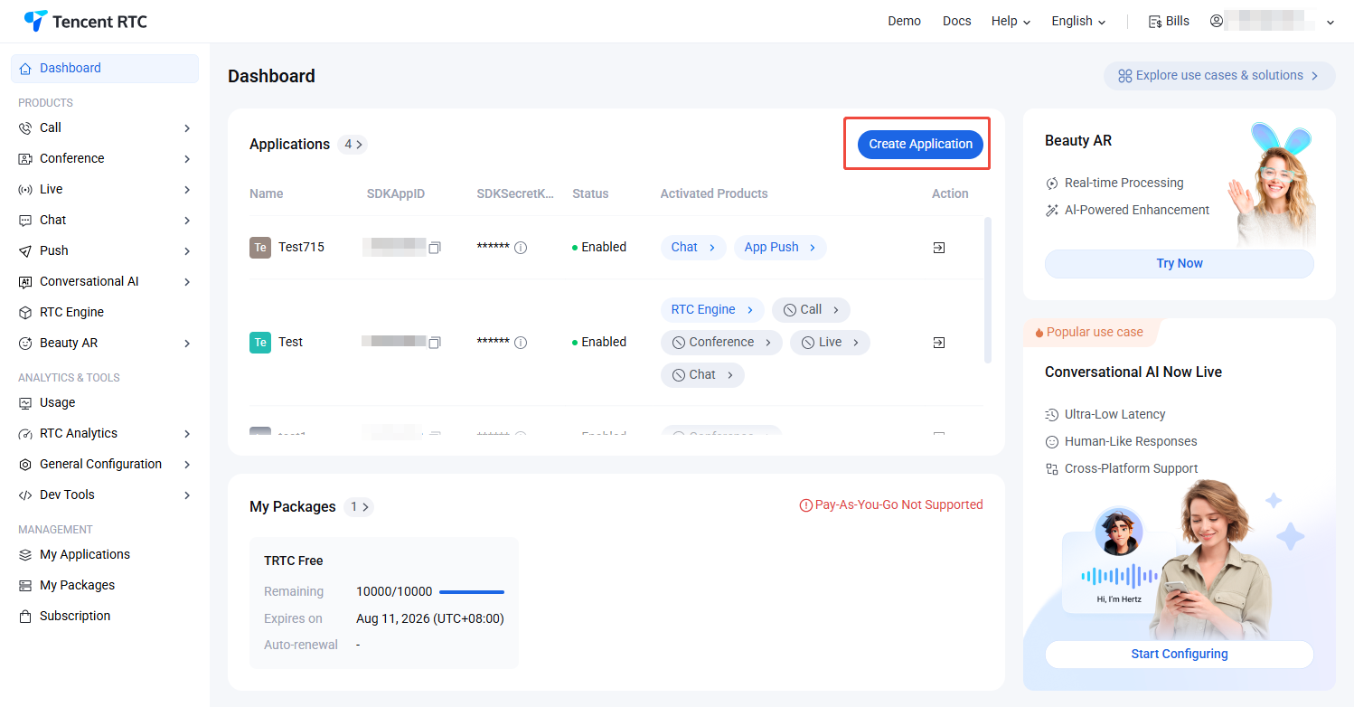
1. Log in to the Chat Console, click Create Application. If you have an existing application, you can omit the application creation process.


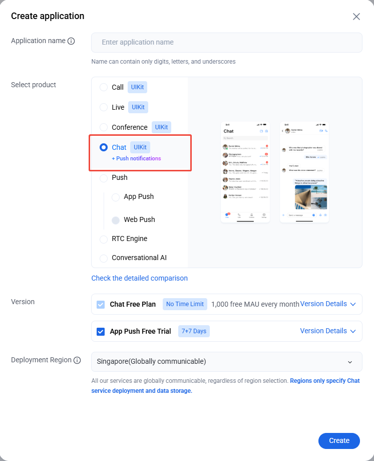
2. Enter the application name in the create pop-up window and choose Chat, select the appropriate Deployment Region, then click Create.


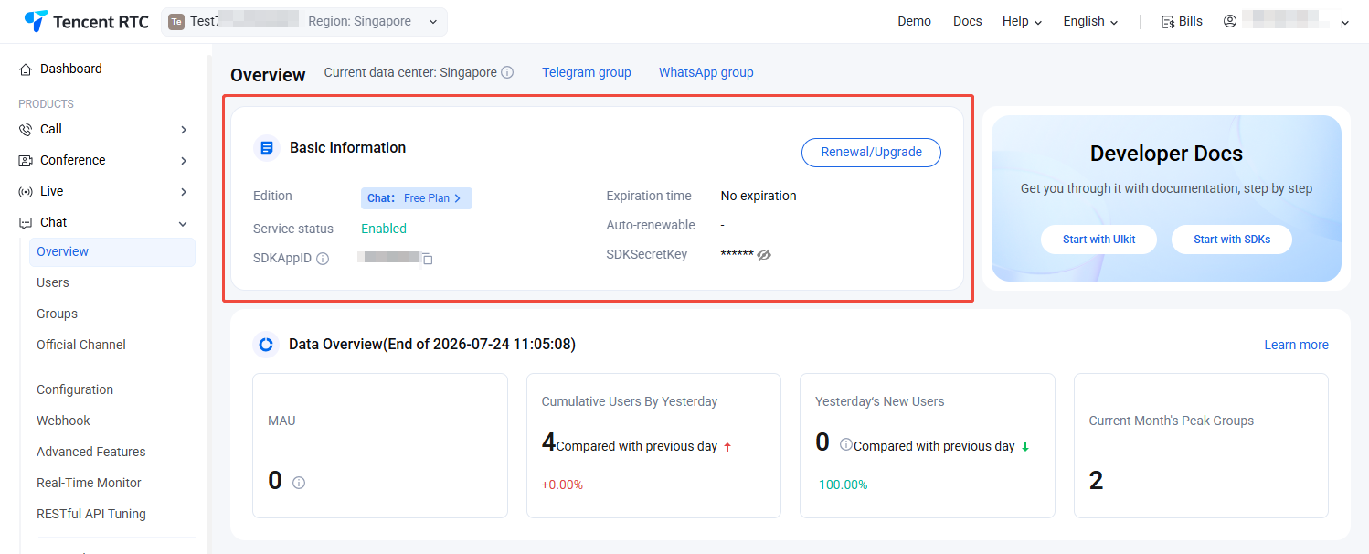
3. On the Chat Product Details, obtain the SDKAppID and key information from the SDKAppID column.


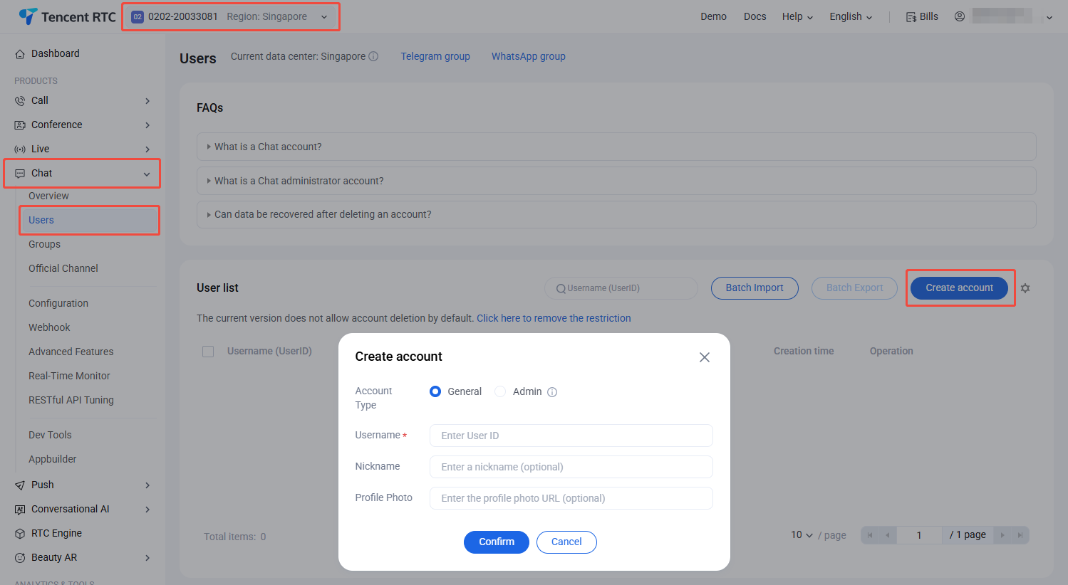
4. Log in to the Chat > Users, create 2–3 test accounts for experience in C2C chat and group chat capacities.


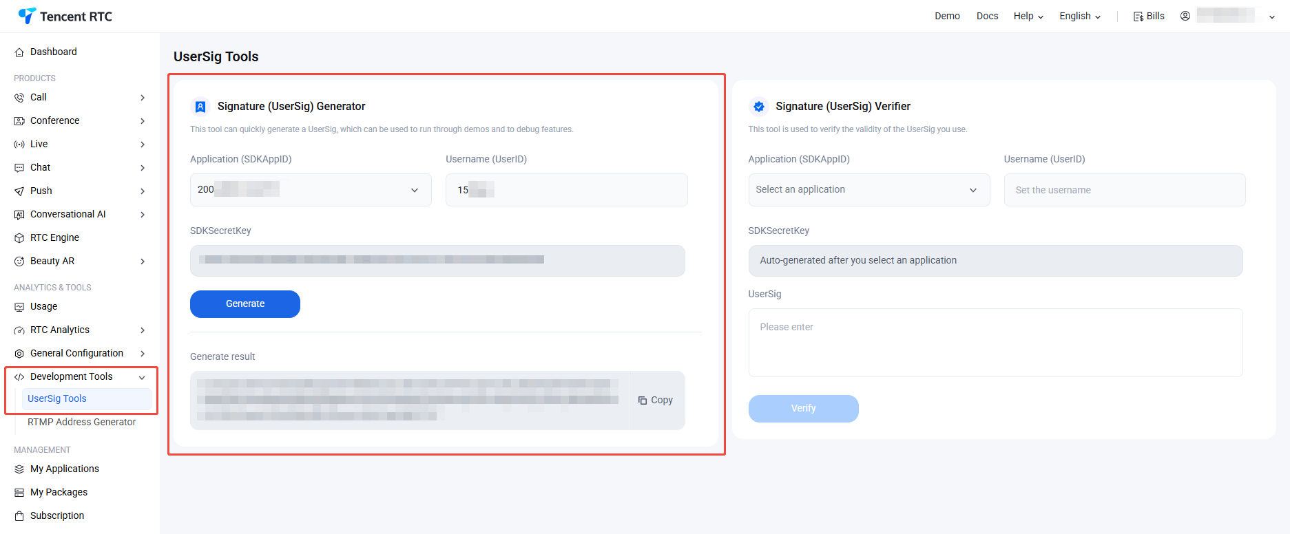
5. UserSig info. Log in to the Chat console > Development Tools > UserSig Tools, fill in the created UserID to generate UserSig.


Step 3: Start the Project

Replace SDKAppID, UserID, and UserSig in App.tsx, then run the following command:
npm run dev
Note:
1. Please ensure that in Step 3 code, SDKAppID, UserID, and UserSig are all successfully replaced. Failure to replace them will result in abnormal project behavior.
2. A userID corresponds to a userSig, for more information, see Generating UserSig.
3. If the project fails to start, please check whether the development environment requirements are met.

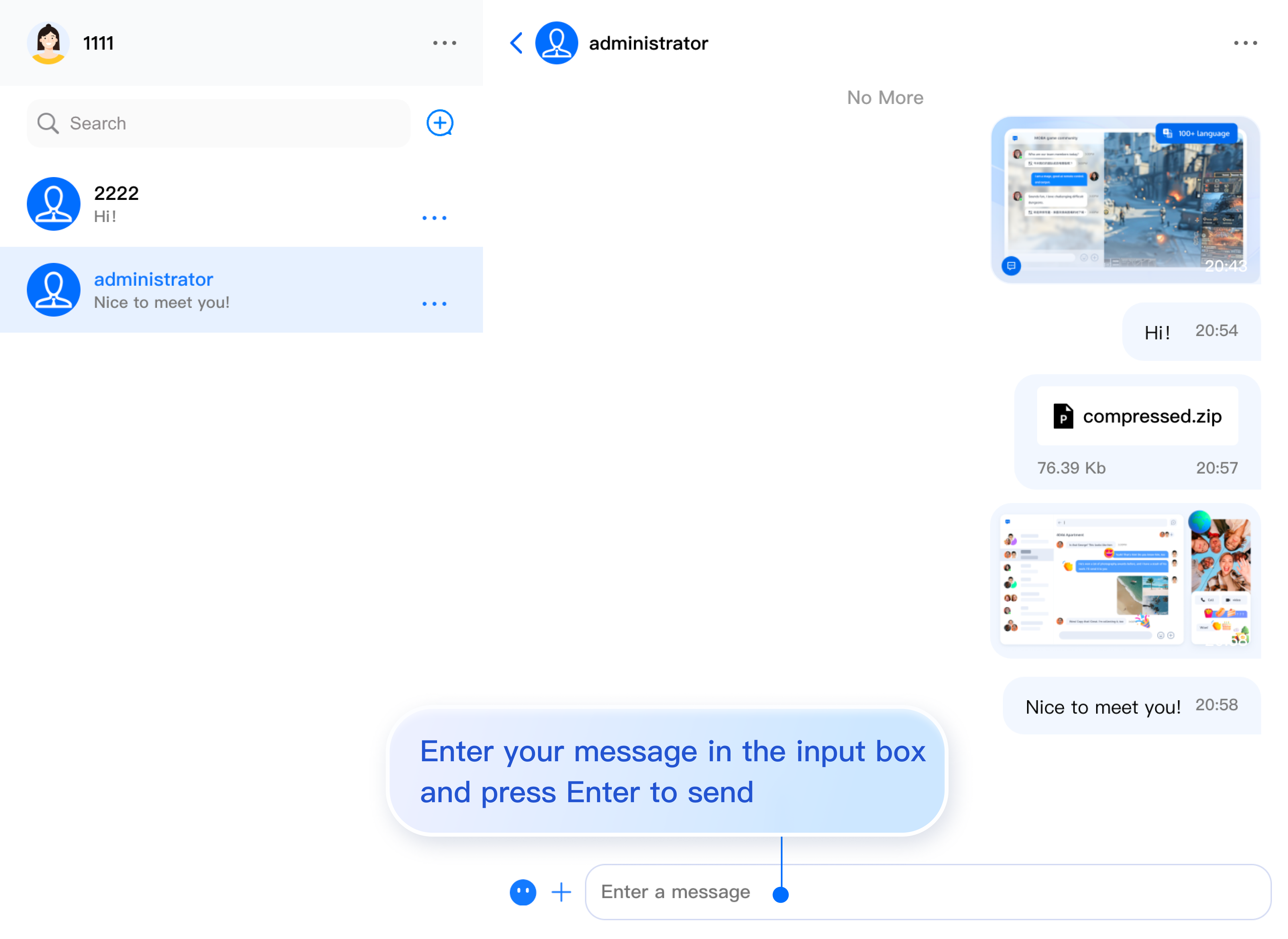
Step 4: Send your first message

Enter your message in the input box and press Enter to send.


Integrate More Advanced Features

Audio/Video Calls

Note:
TUICallKit is an Audio/Video Calls UI component developed by TRTC. Integrating TUICallKit allows you to add Audio/Video Calls functionality to your chat application with minimal code. For comprehensive setup instructions, see Audio/Video Calls > Activate the service.
1. Install the @trtc/calls-uikit-react dependency.
npm install @trtc/calls-uikit-react
2. Import TUICallKit from @trtc/calls-uikit-react and mount it to a DOM node. Add the following code to your src/App.tsx file:
// src/App.tsx
import { TUICallKit } from '@trtc/calls-uikit-react';

function App() {
return (
<UIKitProvider>
// Import TUICallKit and add it to your code
<TUICallKit className="call-kit" />
<ChatApp />
</UIKitProvider>
);
}
3. Enable the component's enableCall property in <ChatHeader />.
<ChatHeader enableCall={true} />

Cloud Search

Tips:
Search is a critical capability for customer service, social networking, online education, telemedicine, and office automation systems. It enables users to quickly find groups, users, and messages, improving both the user experience and engagement.
Due to limitations in local storage within the Web platform, Vue does not support local search. To address these requirements, we provide Cloud Search functionality.
Cloud Search supports both global search and in-conversation search, allowing you to search groups, users, and messages.
Cloud Search is a value-added feature and requires the purchase of the Cloud Search plugin. To purchase, click Purchase.
Cloud Search is enabled by default in "Step 2". If you need to disable Cloud Search, refer to the steps below:
1. Comment out the ChatHeader property ChatHeaderRight, along with any code related to the in-conversation search sidebar.
<ChatHeader
enableCall={true}
ChatHeaderRight={
<div className="header-actions">
{/* <button
className="icon-button"
onClick={() => setIsSearchInChatShow(!isSearchInChatShow)}
>
<IconSearch size="20px" />
</button> */}
<button
className="icon-button"
onClick={() => setIsChatSettingShow(!isChatSettingShow)}
>
<IconBulletpoint size="20px" />
</button>
</div>
}
/>
2. Disable Cloud Search in the ConversationList component.
<ConversationList enableSearch={false} enableCreate={false} />

FAQs

What is UserSig?

A UserSig is a password for users to log in to Chat. It is essentially the ciphertext generated by encrypting information such as the UserID.

How can I generate a UserSig?

The issuance method for UserSig involves integrating the calculation code of UserSig into your server, and providing an interface oriented towards your project. When UserSig is needed, your project sends a request to the business server to access the dynamic UserSig. For more information, please see How to Generate a UserSig on the Server.
Note:
The exemplary code provided in this document retrieves the UserSig by embedding the SECRETKEY in the client code. This approach makes the SECRETKEY highly susceptible to decompilation and reverse engineering. Once your encryption key is compromised, attackers can misappropriate your Tencent Cloud traffic. Hence, this procedure is exclusively recommended for running functional debugging locally. For the correct issuance of UserSig, please refer to the previous sections.

Does it support React 17?

React v17.x is currently not supported. We only support React v18.2 or higher.

Can I use third-party component libraries, such as Material UI?

Yes, you can use other libraries for the "glue code" connecting the core components. You can see this in the example below, where <ChatSetting /> is encapsulated within a Drawer component. However, please note that the internal elements of the core components cannot be modified at this time.
import Drawer from '@mui/material/Drawer';
import { useState } from 'react';

// ... inside your component
const [isChatSettingShow, setIsChatSettingShow] = useState(false);

const onChatSettingClose = () => {
setIsChatSettingShow(false);
};

<Drawer
anchor="right"
open={isChatSettingShow}
onClose={onChatSettingClose}
>
{/* Material UI Drawers wrap content directly */}
<h3>Settings</h3>
<ChatSetting />
</Drawer>

Using Emoji Packs

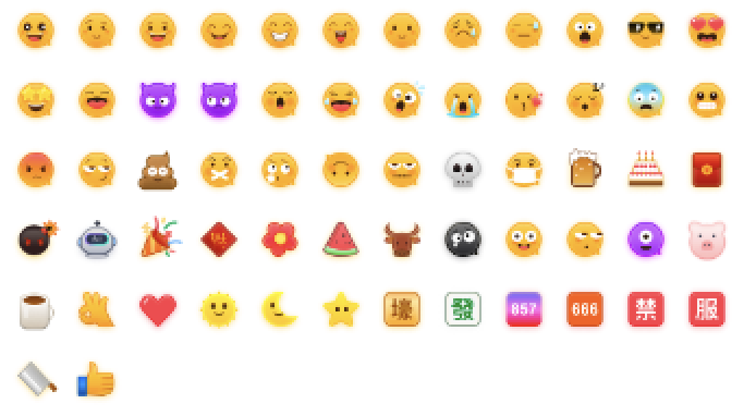
To respect the copyright of emoji designs, the Chat Demo/TUIKit project does not include large emoji graphics. Please replace them with your own designs or other emoji packs for which you hold the copyright before officially launching for commercial use. The default smiley face emoji pack shown below is copyrighted by Tencent RTC, you can upgrade to Chat Pro Plus Edition and Enterprise Edition to use it for free.
Contact Us

Join the Telegram Technical Exchange Group or WhatsApp Exchange Group to enjoy support from professional engineers and solve your problems.

Reference

For more features, refer to the ChatEngine API documentation:

Bantuan dan Dukungan

Apakah halaman ini membantu?

masukan