Release Notes
Announcements
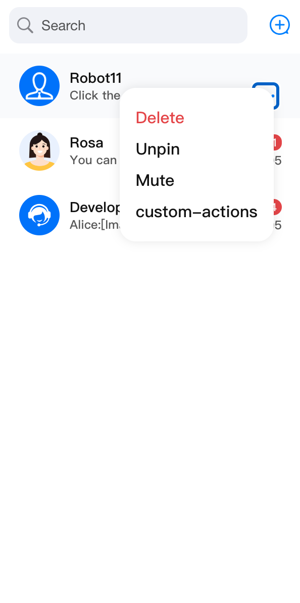
ConversationActions component is responsible for row operations on a single session, supported by default with delete conversation, pin conversation to top/unpin, and mute/unmute features.ConversationActions in ConversationList, you can customize it directly through the top-level actionsConfig parameter of ConversationList. actionsConfig supports default conversation operation feature toggles, event response, adding new custom action items, and basic UI customization.ConversationActions.import { UIKitProvider, ConversationList } from "@tencentcloud/chat-uikit-react";import type { ConversationModel } from "@tencentcloud/chat-uikit-react";const App = () => {return (<UIKitProvider><ConversationListactionsConfig={{enablePin: false,onConversationDelete: (conversation: ConversationModel) => { console.log('Delete conversation success'); },customConversationActions: {'custom-actions-1': {label: 'custom-actions',onClick: (conversation: ConversationModel) => { console.log(conversation); },},},}}/></UIKitProvider>);}
import { UIKitProvider, ConversationList, ConversationActions } from "@tencentcloud/chat-uikit-react";import type { ConversationActionsProps } from '@tencentcloud/chat-uikit-react';const CustomConversationActions = (props: ConversationActionsProps) => {return <ConversationActions {...props} enableDelete={false} />;};const App = () => {return (<UIKitProvider><ConversationListstyle={{ maxWidth: '300px', height: '600px' }}ConversationActions={CustomConversationActions}/></UIKitProvider>);}
ConversationActions component API type ConversationActionsProps is based on ConversationActionsConfig API and expanded. ConversationActionsProps | |||
Parameter Name | Type | Default Value | Note |
conversation(Required) | ConversationModel | - | This parameter is required and represents the session for the current rendered conversation operation. |
className | String | - | Custom root element class name. |
style | React.CSSProperties | - | Custom root element style. |
ConversationActionsConfig | | | |
Parameter Name | Type | Default Value | Note |
enablePin | Boolean | true | Whether to display the pin to top feature button. |
enableMute | Boolean | true | Whether to display the do not disturb feature button. |
enableDelete | Boolean | true | Whether to display the deletion feature button. |
onConversationPin | (conversation: ConversationModel, e?: React.MouseEvent) => void | - | Customize the behavior of pinning/unpinning conversations. |
onConversationMute | (conversation: ConversationModel, e?: React.MouseEvent) => void | - | Customize the behavior of do not disturb/cancel Do Not Disturb session. |
onConversationDelete | (conversation: ConversationModel, e?: React.MouseEvent) => void | - | Customize the behavior of deleting conversations. |
customConversationActions | - | Custom session operation items. | |
PopupIcon | ReactElement | - | Custom action pop-up icon. |
PopupElements | ReactElement[] | - | Content of the custom action popup. |
onClick | (e: React.MouseEvent, key?: string, conversation?: ConversationModel) => void | - | Callback function for click action. |
enablePin, enableDelete, and enableMute parameters, you can flexibly control the display of conversation pinning, mute message notification, and conversation deletion in ConversationActions.<ConversationActions enablePin={false} />
<ConversationActionsenableDelete={false} />
<ConversationActionsenableMute={false} />
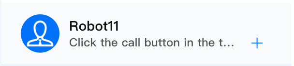
enablePin={false} | enableDelete={false} | enableMute={false} |
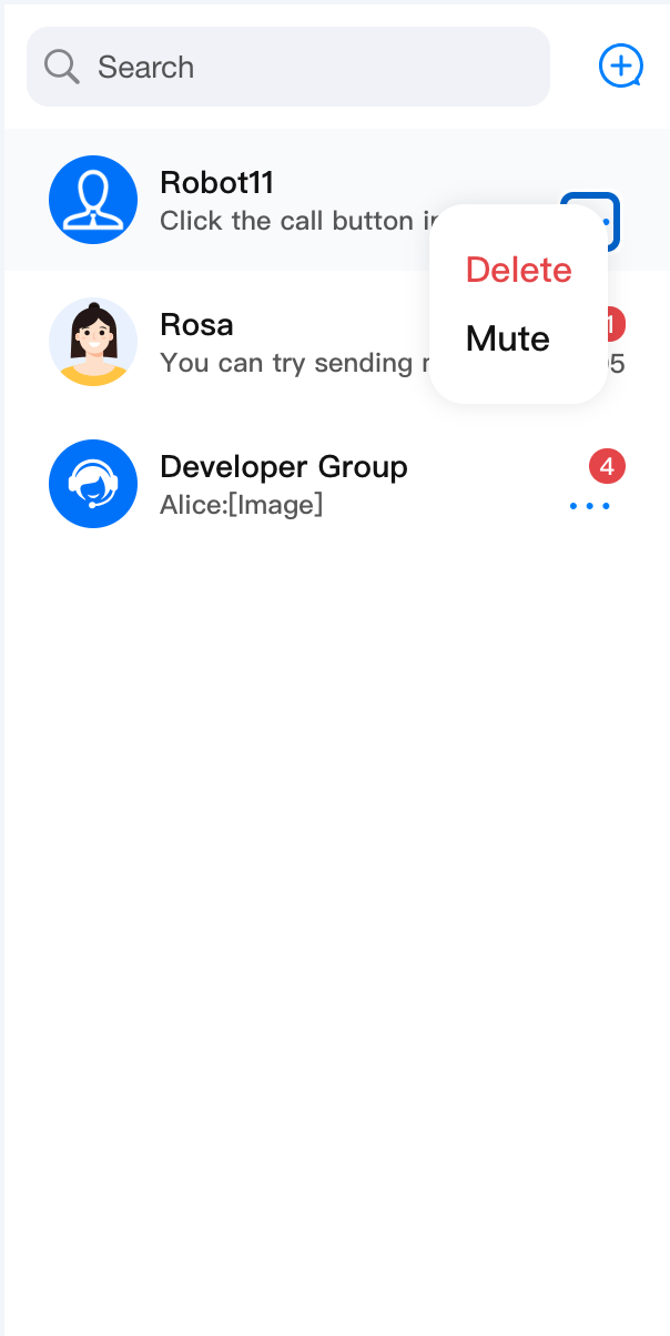 | 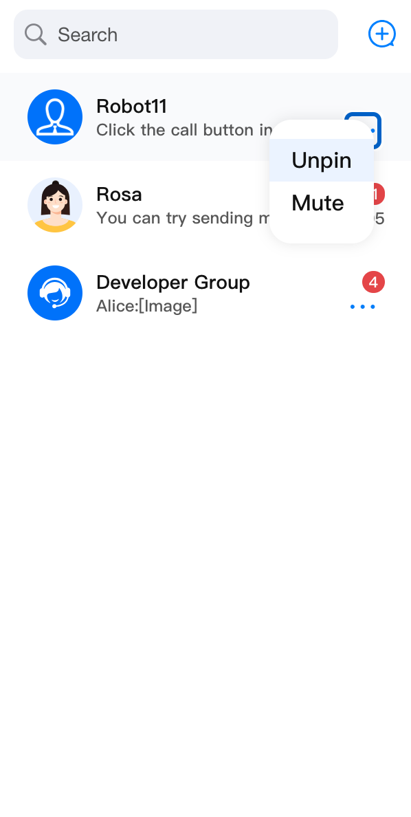 | 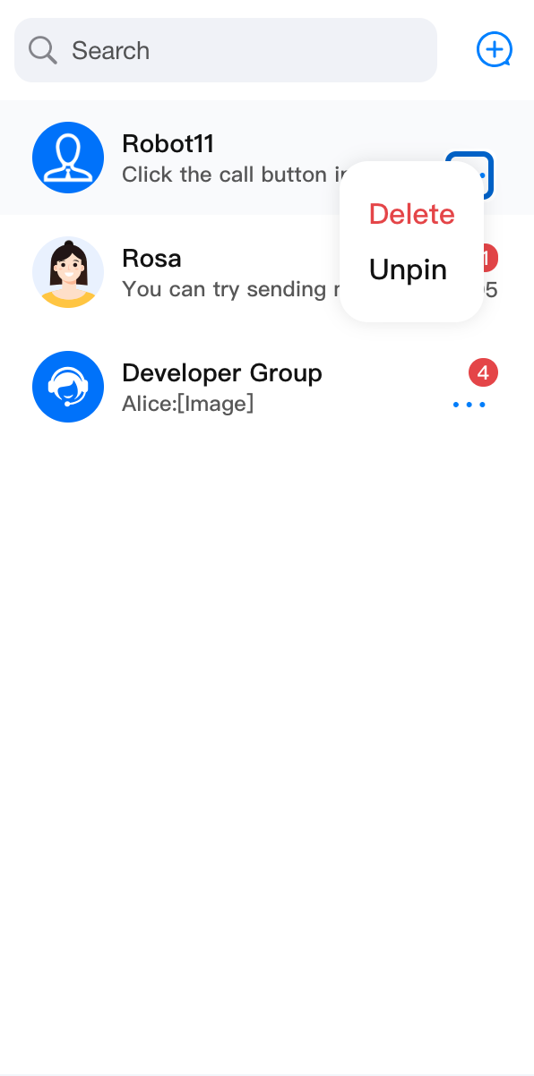 |
ConversationActions component supports delete conversation, pin conversation to top/unpin, and mute/unmute features by default. If the event response of existing functionality does not meet your needs, you can customize the event response handling function and override it. In addition to customizing feature event responses, you can also obtain basic click event response through onClick.import { ConversationList, ConversationActions, Toast } from '@tencentcloud/chat-uikit-react';import type { ConversationActionsProps, ConversationModel } from '@tencentcloud/chat-uikit-react';const CustomConversationActions = (props: ConversationActionsProps) => {return (<ConversationActions{...props}onConversationDelete={(conversation: ConversationModel) => {conversation.deleteConversation().then(() => {Toast({ text: 'delete conversation successfully!', type: 'info' });}).catch(() => {Toast({ text: 'delete conversation failed!', type: 'error' });});}}/>);};<ConversationList ConversationActions={CustomConversationActions} />
customConversationActions is used to add new custom action items to the ConversationActions list.ConversationActionItem | |||
Parameter Name | Type | Default Value | Note |
enable | Boolean | true | Whether to enable custom action items. |
label | String | - | Display content of custom action items. |
onClick | (conversation: ConversationModel, e?: React.MouseEvent) => void | - | Callback function for clicking a custom action item. |
customConversationActions:import { ConversationList, ConversationActions } from '@tencentcloud/chat-uikit-react';import type { ConversationActionsProps, ConversationModel } from '@tencentcloud/chat-uikit-react';const CustomConversationActions = (props: ConversationActionsProps) => {return (<ConversationActions{...props}customConversationActions={{'custom-actions-1': {label: 'custom-actions',onClick: (conversation: ConversationModel) => { console.log(conversation); },},}}/>);};<ConversationList ConversationActions={CustomConversationActions} />
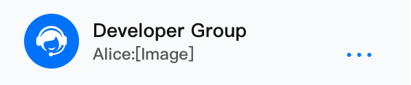
Before modification | After modification |
 |  |
PopupIcon parameter and the popup content through PopupElements.ConversationActions component to customize a new awakening button style:import { ConversationList, ConversationActions, ConversationActionsProps } from '@tencentcloud/chat-uikit-react';import type { ConversationActionsProps } from '@tencentcloud/chat-uikit-react';const CustomConversationActions = (props: ConversationActionsProps) => {const customIcon = <div>Custom Icon</div>return (<ConversationActions {...props} PopupIcon={customIcon} />);};<ConversationList ConversationActions={CustomConversationActions} />
Before modification | After modification |
 |  |
Was this page helpful?
You can also Contact sales or Submit a Ticket for help.
Help us improve! Rate your documentation experience in 5 mins.
Feedback